2024, bet365
A focused improvement of the Bet365 app’s user experience through research-driven design solutions, streamlining navigation, and enhancing usability to boost user satisfaction and retention.
Problem Statement
In the competitive online sports betting market, users demand a smooth sign-up experience. A complicated process risks losing them to rivals, so I tackled Bet365’s clunky registration to boost acquisition and engagement.
The Challenge: Simplifying Sign-Up
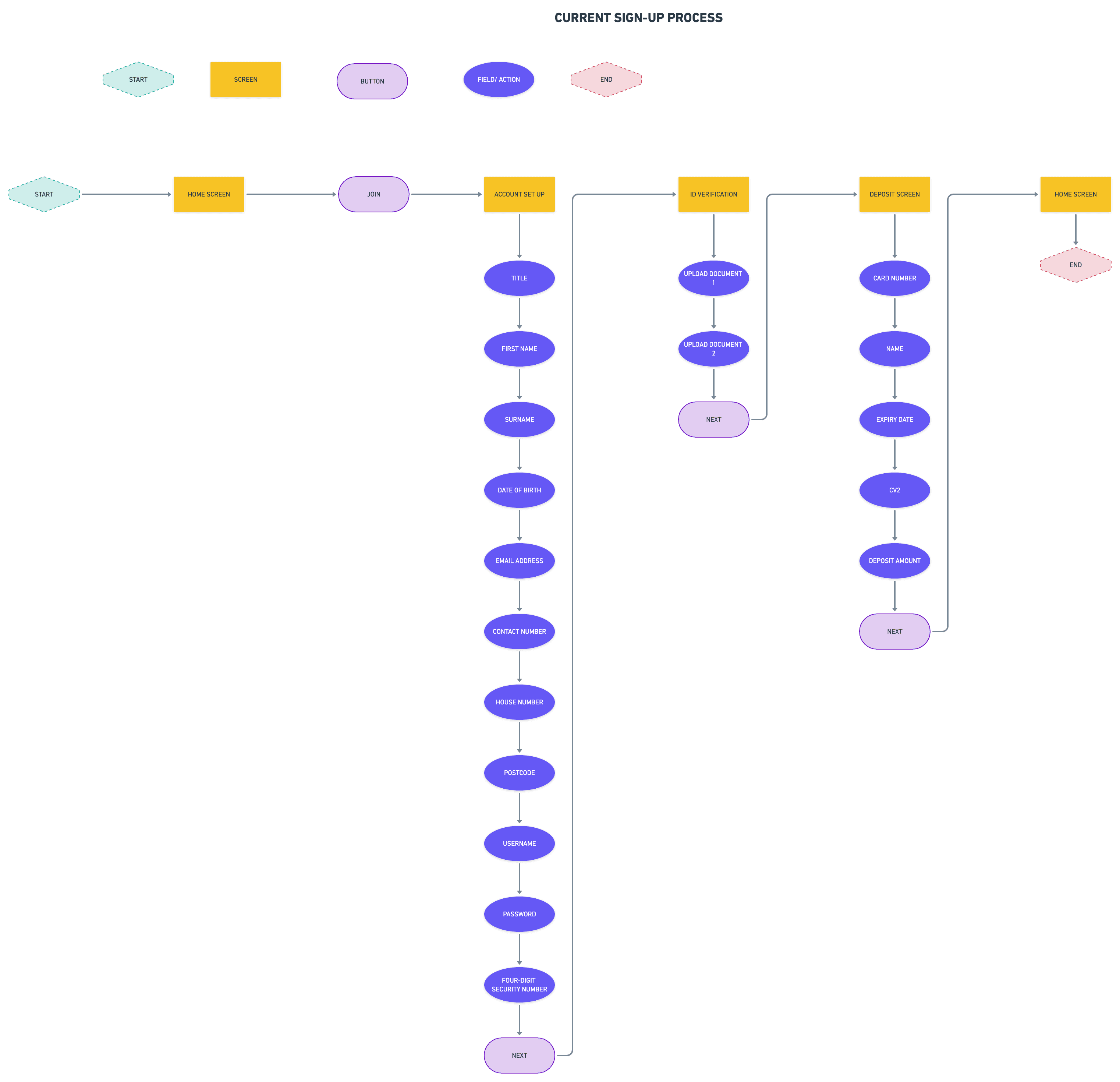
The existing single-step sign-up overwhelmed users with too many fields, causing confusion, frustration, and drop-offs due to unclear progress and effort.
My Approach: Mapping the Mess
I started by charting the current user flow, pinpointing bottlenecks and inefficiencies that drove abandonment and dented trust.
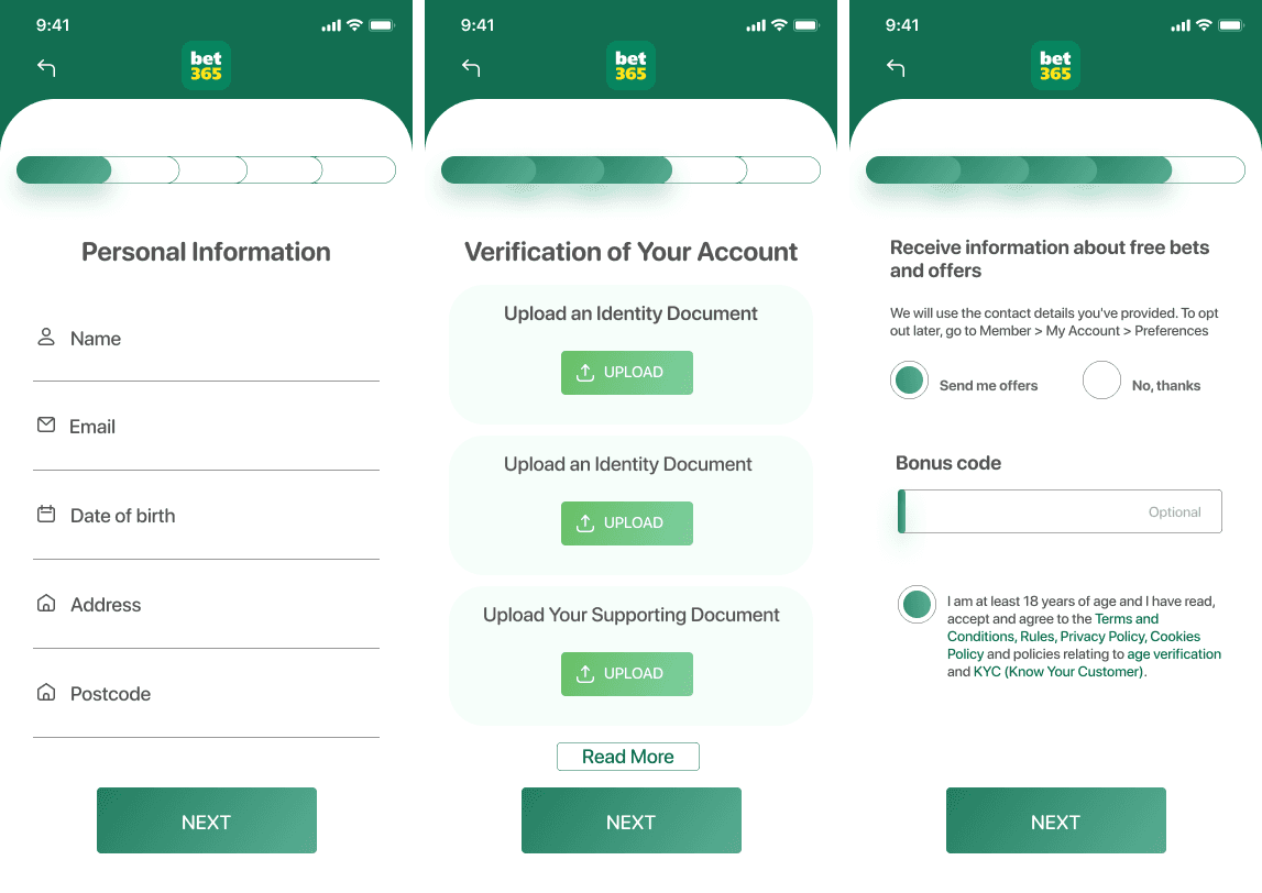
My Solution: A Streamlined Journey
- Bite-sized steps for clarity.
- Progress indicators for guidance.
- Brand consistency with regulatory compliance.
My Strategy: User-First Design
I focused on:
Usability: Making it intuitive and low-effort.
Efficiency: Cutting completion time without skimping on accuracy.
Consistency: Matching Bet365’s design language.
Compliance: Meeting legal standards.
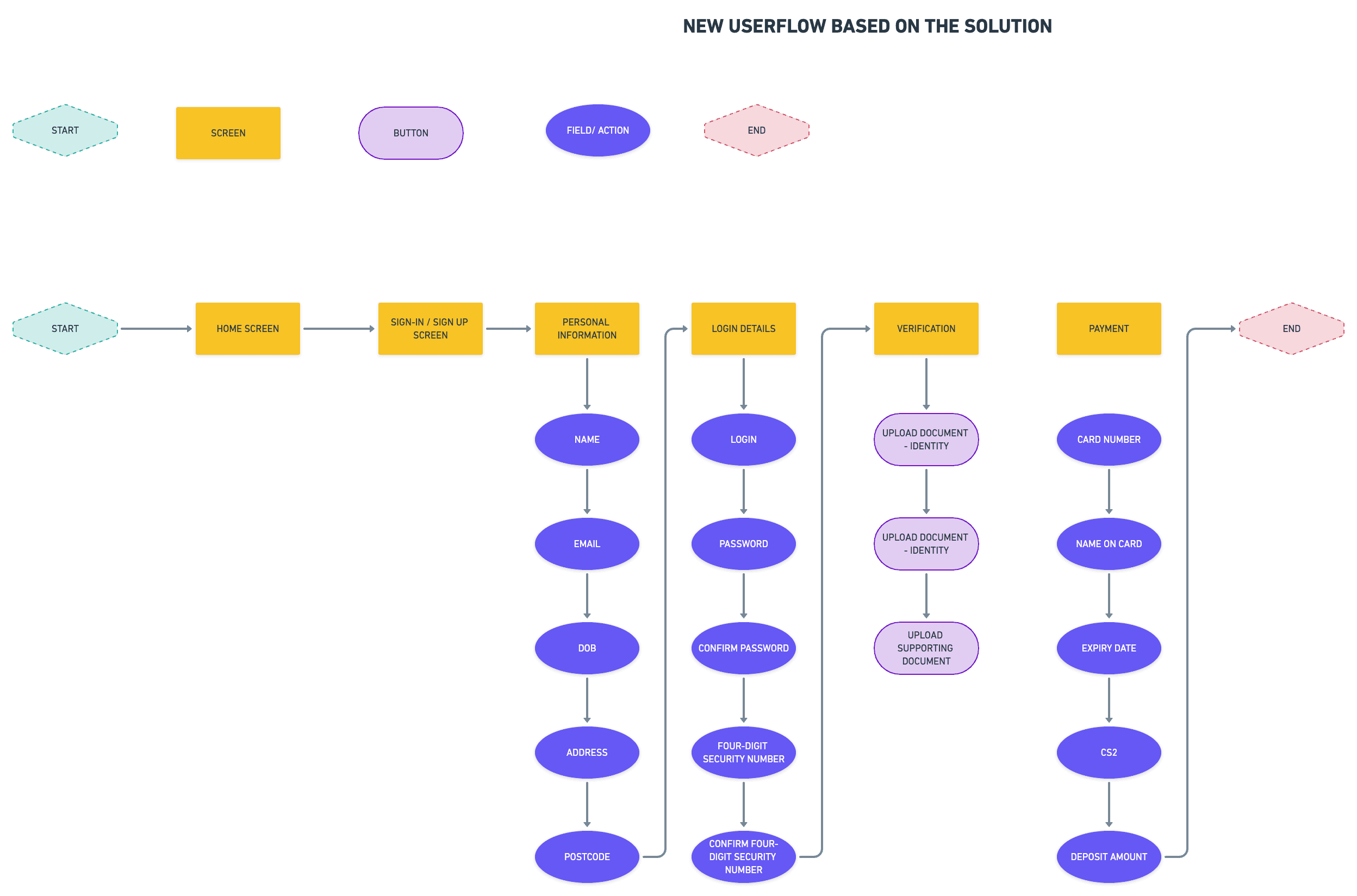
My Process: From Sketch to Screen
I mapped the old flow, then crafted a multi-step redesign. Low-fidelity wireframes in Figma nailed the structure, followed by high-fidelity prototypes blending Bet365’s style with better layouts and responsive design.


Final Design
Stepped Flow: Logical input stages.
Progress Bar: Clear journey tracking.
Branded UI: Familiar yet refined for usability.